Statistics
Statistics
The Statistics tab turns your transactions into a clear picture of where money comes from and where it goes. Everything is shown in your reporting currency, converted from each account.
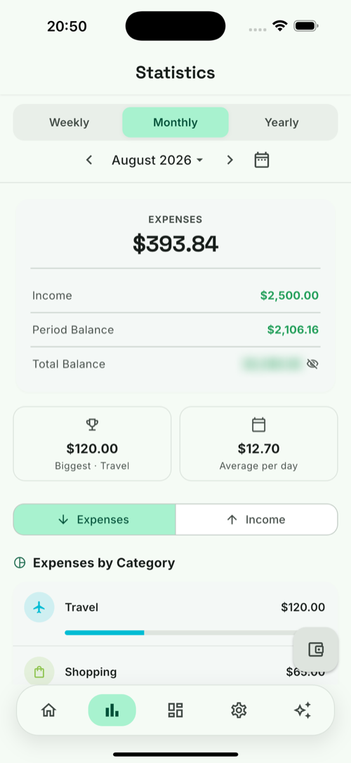
Pick a period
Switch between Weekly / Monthly / Yearly and step through periods with the arrows, or jump to any month with the date picker.
What you’ll see
- Net worth trend — a line of your total balance over the last several periods, with the change vs the previous one (e.g. ↓ 4.9%).
- Income vs Expenses — side-by-side bars per period, so you can see whether you’re net-positive at a glance.
- Summary card — Income, Expenses, Period balance and Total balance for the selected period (tap the eye to hide the total).
- By category — a donut of your spending (or income) split by category, with a ranked list and each category’s share and amount.
Filters
Narrow any view by account, by month/period, and (with multi-currency data) see everything normalised into one currency. Toggle between Expenses and Income to analyse each side separately.
📊
Numbers here use the entry-time exchange rate stored on each transaction, so the
same period always reports the same totals — even months later.